As I was socializing with my coworkers at our weekly social hour, my colleagues noted that they were getting an Earthquake Early Warning. Soon after they reported feeling the ground shake.
After refreshing the USGS earthquakes map webpage a few times, the earthquake showed up. Methinks it was a M 5.5 at first, and changed a few times over the coming minutes (eventually settling on M 5.5).
https://earthquake.usgs.gov/earthquakes/eventpage/ew1683847190/executive
Cindy and I realized that we would need to get to work preparing an Earthquake Quick Report. We had not yet gotten notifications from our information sources, but we left the social hour to get to work.
Cindy and I got our report out and our other colleague Brian got some tweets out from our twitter account. It is important to provide information in a rapid manner so that people learn that they can rely upon us as a credible source of information.
The earthquake reminded me of an earthquake sequence in 2013. I remember discussing this M 5.7 sequence in real time with other colleagues, like Danielle. This was early in the earthjay years, so I was still getting used to preparing material for Earthquake Reports.
https://earthquake.usgs.gov/earthquakes/eventpage/nc71996906/executive
The 2013 M 5.7 was a normal oblique (combination of tension and strike-slip) earthquake mainshock. The earthquake mechanisms for the 2013 and 2023 earthquakes are remarkably similar.
These earthquakes happened along the Almanor fault zone, a right-lateral strike-slip and extensional fault system. Further to the south is the Mohawk Valley fault zone (MHVZ), a right-lateral strike-slip fault system.
The relative plate motions between the North America and Pacific plates (plate motion localized along faults like the San Andreas) cause this region of northern California to experience transtension (combination of strike-slip and extension). The relative plate motions are accommodated by fault slip on both strike-slip faults and normal (tensional) faults.
The MVFZ feeds right-lateral (“dextral”) shear from the Walker Lane. The Walker Lane is the northern extension of the Eastern California Shear Zone. These dextral fault systems may accommodate about 20% of the relative plate motion between the North America and Pacific plates.
There are a number of valleys that have been formed from the extension on the normal faults. As earthquakes slip on these normal faults, the center of the valleys subside (forming what we call grabens if there are normal faults on each side of the valley, or half grabens if the fault is only on one side).
The 2015 Pacific Cell Friends of the Pleistocene led us on a tour of the Quaternary stratigraphy of the Mohawk Valley fault zone.
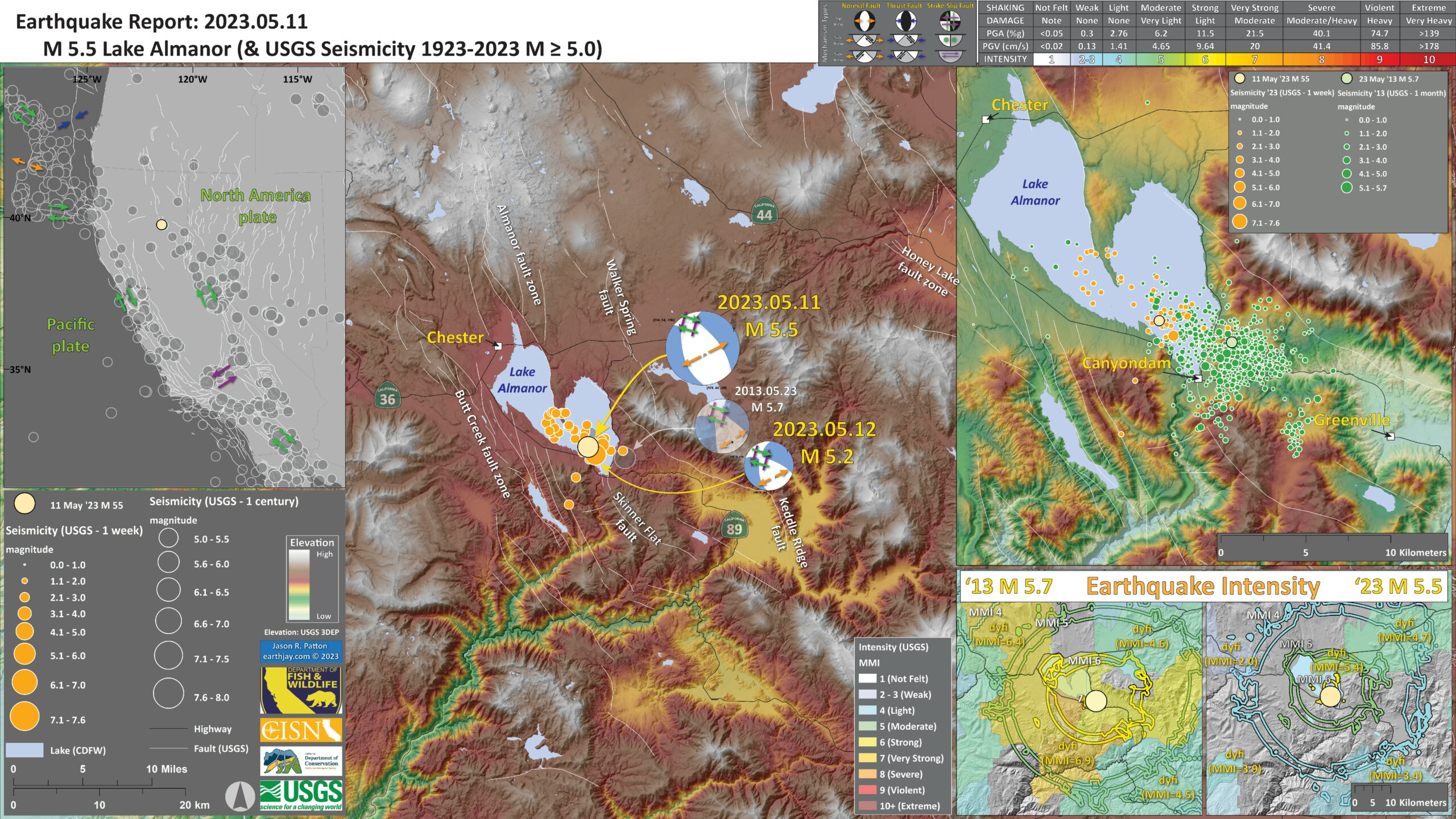
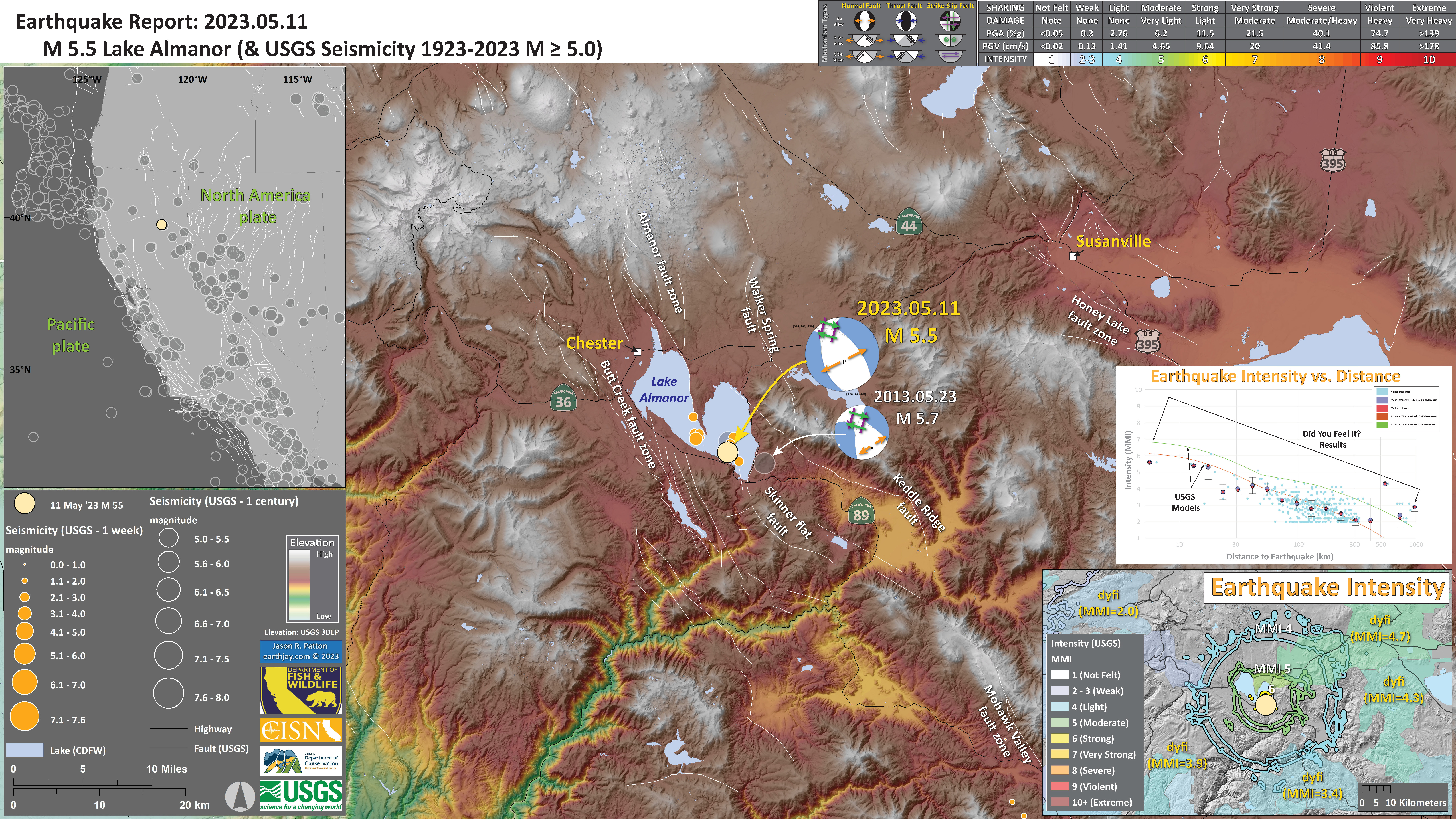
Below is my interpretive poster for this earthquake
- I plot the seismicity from the past month, with diameter representing magnitude (see legend). I include earthquake epicenters from 1922-2022 with magnitudes M ≥ 3.0 in one version.
- I plot the USGS fault plane solutions (moment tensors in blue and focal mechanisms in orange), possibly in addition to some relevant historic earthquakes.
- A review of the basic base map variations and data that I use for the interpretive posters can be found on the Earthquake Reports page. I have improved these posters over time and some of this background information applies to the older posters.
- Some basic fundamentals of earthquake geology and plate tectonics can be found on the Earthquake Plate Tectonic Fundamentals page.
- In the upper left corner is a map that shows the main tectonic boundaries, crustal faults, and a century of seismicity.
- In the lower right corner is a map that shows the earthquake intensity using the modified Mercalli intensity scale. Earthquake intensity is a measure of how strongly the Earth shakes during an earthquake, so gets smaller the further away one is from the earthquake epicenter. The map colors represent a model of what the intensity may be. The USGS has a system called “Did You Feel It?” (DYFI) where people enter their observations from the earthquake and the USGS calculates what the intensity was for that person. The transparent colors with yellow labels show what people actually felt in those different locations.
- Above the map is a plot that shows the same intensity (both modeled and reported) data as displayed on the map. Note how the intensity gets smaller with distance from the earthquake.
I include some inset figures. Some of the same figures are located in different places on the larger scale map below.
- Here is the map with 2 week’s seismicity plotted.
- Here is the map with aftershocks plotted and comparisons with the 2013 M 5.7 Earthquake Sequence.
- Note the large number of triggered and aftershock earthquakes from 2013. This represents a month of time and there were about 770 earthquakes, with four M>4 events.
- When I put the aftershock poster (less than 24 hours later), there were 50 aftershocks (with one M>5). There have only been a handful since then so it looks like the aftershock decay is winding down.
- Though the USGS is setting up a seismic array to detect more aftershocks as a local network will be able to detect events of smaller magnitudes. Events like this provide an opportunity to study the subsurface structures as this “microseismicity” can align with the faults and people can visualize these.
- In the lower right corner is a comparison of the modeled and reported intensity (using MMI scale) for these two earthquakes.

Some Relevant Discussion and Figures
- This is a great overview map showing the plate boundary fault systems from Dr. Jayne Bormann’s submission to the 2015 FOP guidebook (Bormann et al., 2015).
- Note how the Eastern California Shear Zone (ECSZ) feeds relative plate motion via fault slip, from the San Andreas along the east side of the Sierra Nevada. This plate motion slip feeds into the Walker Lane.
- There remains considerable debate about how this Pacific-North America relative plate motion goes north of the Walker Lane. Some suggest it feeds into the eastern Cascades and others suggest that it feeds out to the subduction zone. It is likely a combination of these two hypotheses.
- Here is the Gold et al. (2014) map. I include the figure caption as a blockquote below.
- This shows the main faults in the region. Note how the main throughgoing faults are right-lateral strike-slip (the lines with the arrows showing the relative motion along the fault), while there are also basin forming normal faults (the lines with the ball tipped line symbols).
- The Mohawk Valley fault zone is highlighted by the white rectangle. Note how it trends to the northwest, towards Quincy and the IVF (the Indian Valley fault runs through Lake Almanor).
- Here is a figure that shows how GPS and seismicity compare with the surface fault mapping.
- The upper panel shows a topographic profile from A-A’ looking northwest from the south eastern side of the box..
- Panel B shows the GPS velocity relative to stable North America. These data are from the GPS sites within the blue rectangle on the map. The crust further to the west is moving faster to the north relative to the crust in the eastern portion.
- Panel C shows the seismicity sourced from the green box.
- Here, Dr. Jayne Bormann and others (Bormann et al., 2015) present additional geodetic profiles. These GPS (or GNSS) rates are relative to stable North America. Note how the western sites move faster to the north relative to the eastern sites.
- This stepwise reduction in northern velocity represents the accumulated strain from the dextral (right-lateral) faults. I.e., going from west to east, each time a dextral fault is crossed, the relative plate velocity decreases.
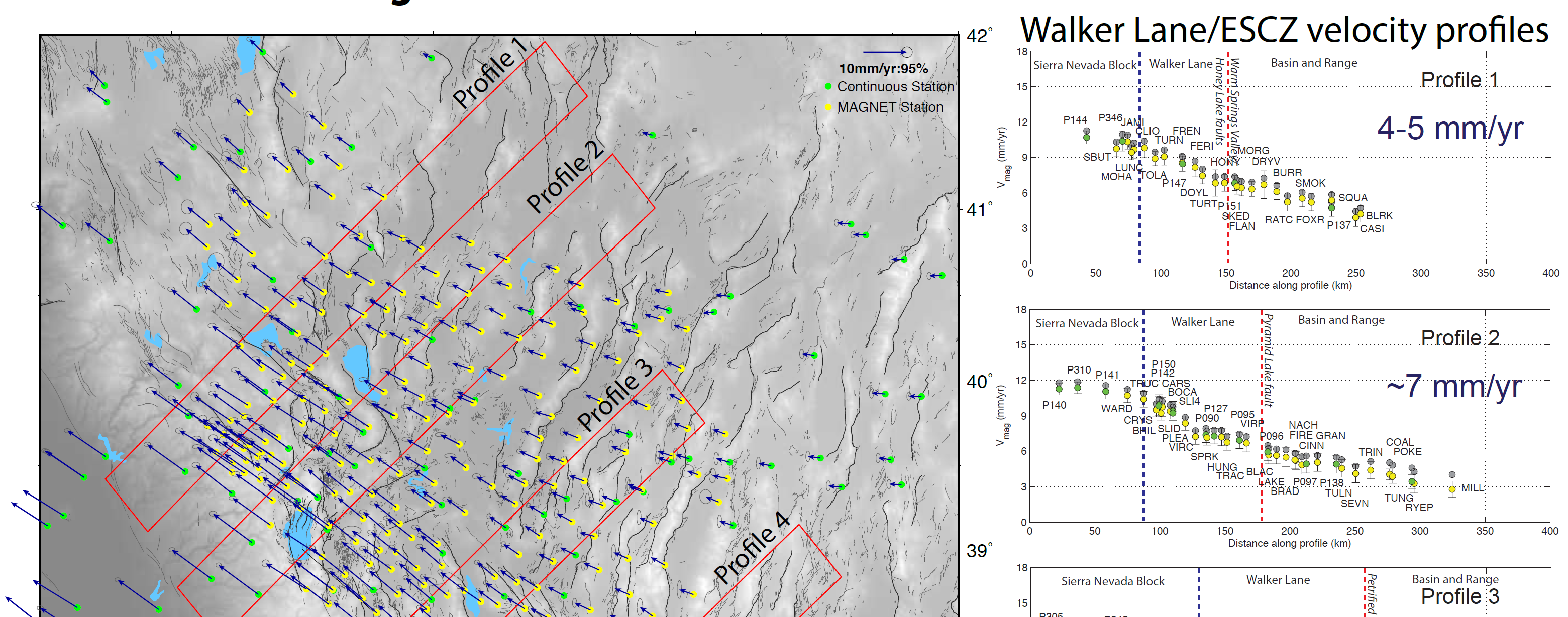
- This is a portion of their poster, highlighting profiles 1 and 2. We can see Almanor Lake in the map just to the northwest of profile 1. The Mohawk Valley fault is in the location of the blue dashed line in the profiles.
- This is a different, more local, map and cross section from Bormann et al. (Bormann et al., 2015). The GNSS velocity data are from sites within the yellow rectangle.
- This profile includes more faults designated by the green dashed lines.
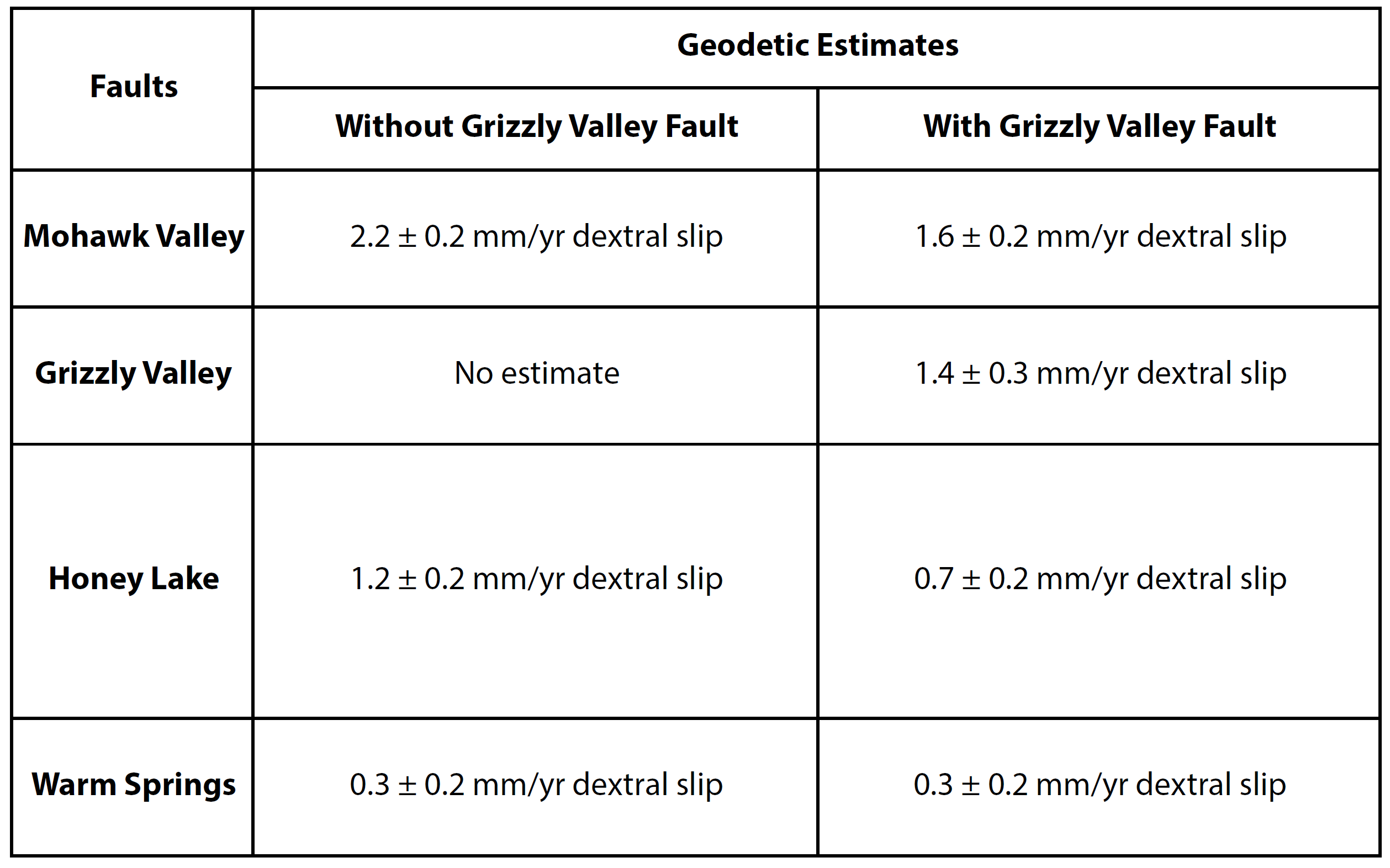
- Here is a table from Dr. Bormann’s FOP trip material (Bormann et al., 2015). Using a complicated yet elegant tectonic block model, with two scenarios, Dr. Bormann estimated the slip rates for the faults in the region.
- They suggest that the MCVF has about 2 mm/year of fault slip (aka slip deficit).
- The following material is from the USGS report on the 2013 M 5.7 Canyondam Earthquake Sequence.
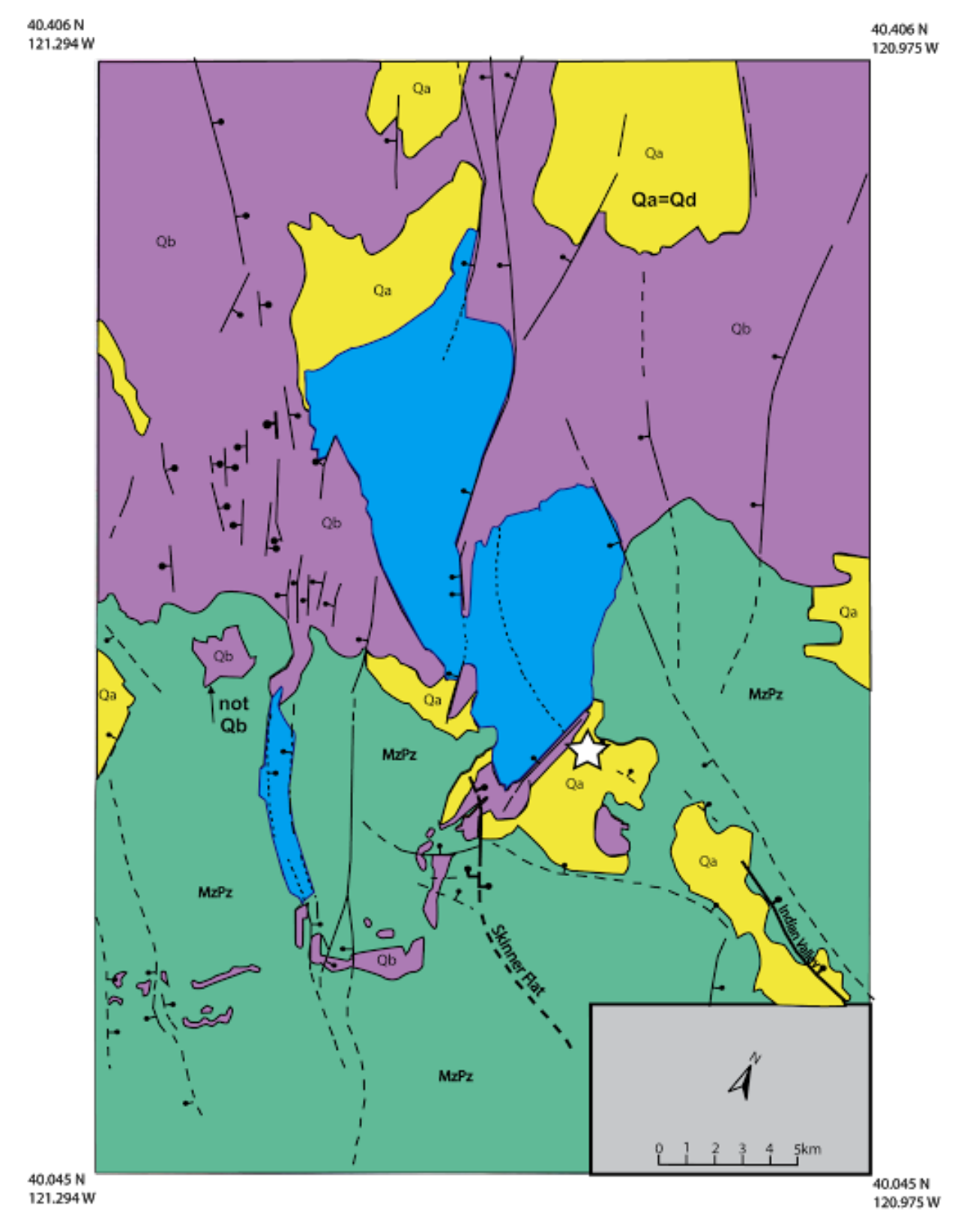
- Here is a geologic map showing the M5.7 epicenter.
- Dr. Angela Jayko is one of the most knowledgeable field geologists that I have ever met. Just look into her publication history, you will see the breadth of experience Jayko has. Truly remarkable.
- Dr. Jayko presented a fascinating interpretation of the interaction of the Klamath and northern Sierra terranes. I just learned lots from a quick glimpse. I learn something new every time I am exposed to Dr. Jayko’s work.
- Here is their (Jayko, 1990) intro small scale map showing the setting for the geologic mapping and interpretation for this 1990 paper.
- Here is the medium scale map of the region from Jayko (1990).
- Here is the large scale map of the region from Jayko (1990)
- These are cross sections whose locations are shown on the above map.
- Here is a map that Dr. Jayko compiled from other geologists.
- Note the Melones fault zone as this is a key part of their next figure.
- Hold on to your hats. You will probably need to read Dr. Jayko’s paper to really understand these hypotheses. I know that I need to spend more time reading that paper!
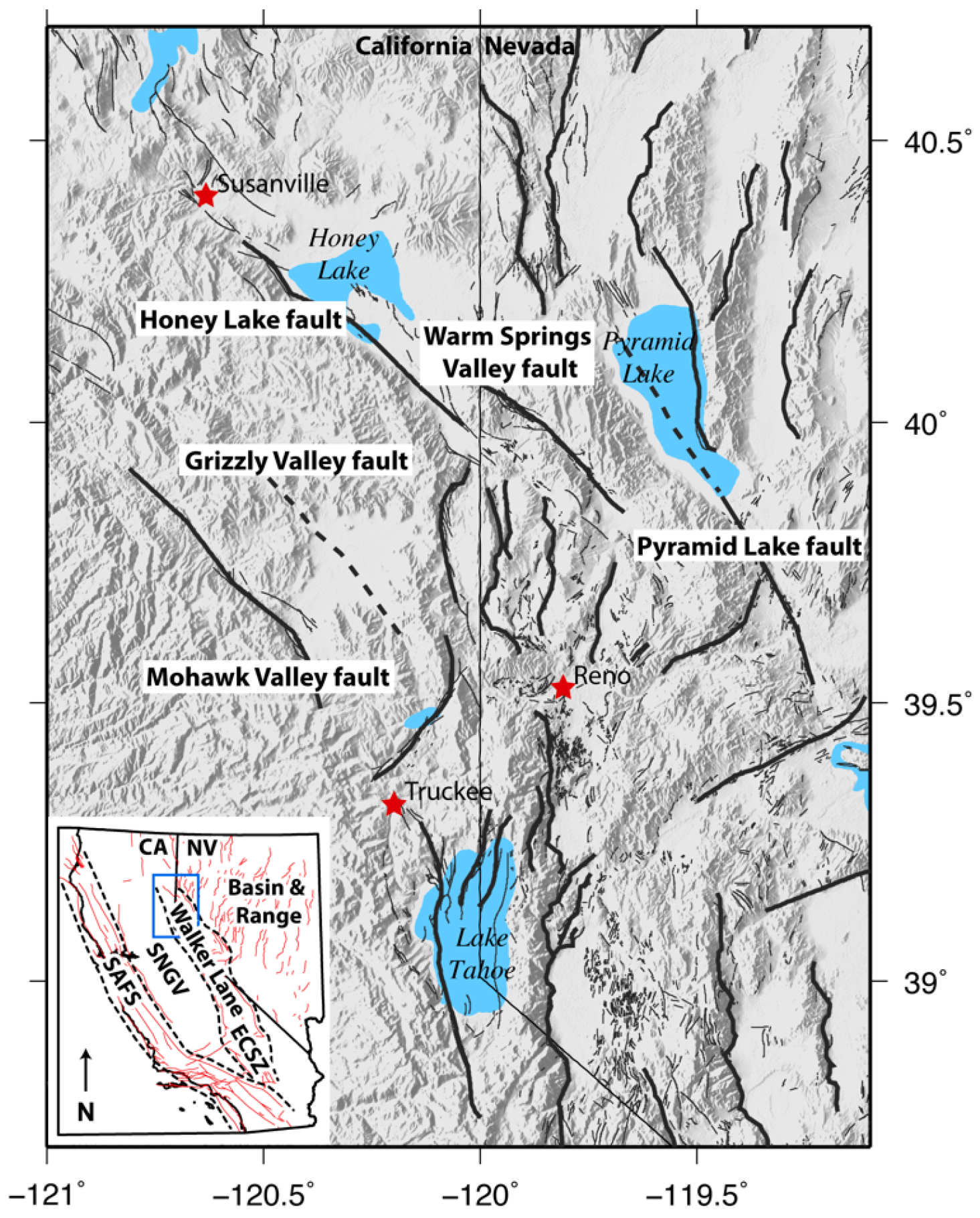
Regional map showing topography and the location of faults in the Northern Walker Lane. Faults are modified from the USGS Quaternary Fault and Fold database [U.S. Geological Survey, California Geological Survey, and Nevada Bureau of Mines and Geology, 2006]. Major faults are drawn in black lines and other Quaternary active faults are drawn in thin gray lines. Towns and cities are indicated by red stars. Inset shows the location of the study area in relation to other elements of the Pacific/North America Plate boundary zone.

Map of the northern Walker Lane study area and regional strike-slip and normal faults, simplified from the U.S. Geological Survey, Nevada Bureau of Mines and Geology, and California Geological Survey [2006], Faulds and Henry [2008], the California Department of Water Resources [1963], Saucedo and Wagner [1992], Hunter et al. [2011], Gold et al. [2013a, 2013b], Olig et al. [2005], and our mapping using lidar data and field observations. Abbreviations: CL, Carson Lineament; DVF, Dog Valley fault; ETFZ, East Truckee fault zone; GVF, Grizzly Valley fault; HLF, Honey Lake fault; HSF, Hot Springs fault; IVF, Indian Valley fault; MVFZ, Mohawk Valley fault zone; OF, Olinghouse fault; PF, Polaris fault; PLF, Pyramid Lake fault; and WSVF, Warm Springs Valley fault. Arrows indicate relative direction of strike-slip fault movement. Bar and ball indicates downthrown block of normal faults. Star depicts location of Sulphur Creek site.
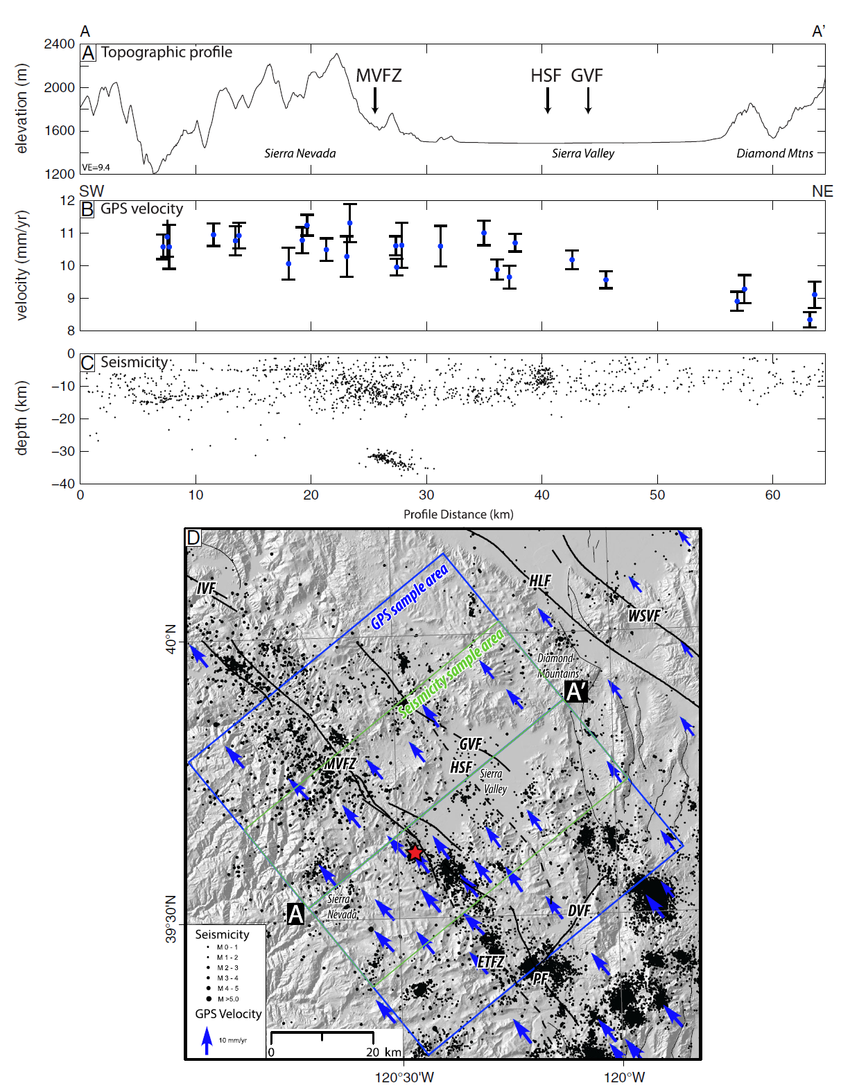
Northeast trending profile from the Sierra Nevada across Sierra Valley which crosses the mapped Mohawk Valley fault zone (MVFZ), Grizzly Valley fault (GVF), and Hot Springs fault (HSF). (a) Topography (National Elevation Data Set 10m DEM). (b) Geodetic data from Hammond et al. [2011] in a Great Basin reference frame (GB09, uncorrected for postseismic relaxation), which show northwest-directed motion relative to the Great Basin to the east. The geodetic data show a gradual eastward decrease in velocities from the Sierra Nevada to the Diamond Mountains. (c) Historical seismicity from 1910 to 2013, M 0–5.3, showing a concentration of earthquakes along themapped trace of MVFZ and other mapped faults in Sierra Valley (Advanced National Seismic System composite catalogue, http://www.quake.geo.berkeley.edu/anss/catalog-search.html, accessed 9 September 2013). The horizontal alignment of earthquakes at 5 km depth results from a default setting in the hypocentral location for earthquake with limited instrumental constraints. (d) Location map showing location of profile line A–A′ and the corresponding swathes from which the geodetic (blue) and seismic data (green) were sampled. Red star indicates location of 27 October 2011, M 4.7 earthquake near the MVFZ.
Western Basin and Range, Walker Lane/ECSZ, and Sierra Nevada GPS velocities in a North America reference frame (NA12) corrected for postseismic relaxation following historic earthquakes in California and Nevada. Velocity uncertainties represent the 95% con ndence interval. Red rectangles mark the locations of GPS velocity profiles across the Walker Lane/ECSZ at various latitudes.
Magnitude of GPS velocities for transects of GPS stations that are perpendicular to the Walker Lane direction of maximum shear strain. Gray circles are the observed rates, green (continuous) and yellow (MAGNET) circles with 2 sigma error bars are the rates corrected for the e ects of viscoelastic postseismic relaxation. Velocity annotations are station names. Dashed lines indicate the location of the Sierra Nevada frontal boundary (blue) and the easternmost Walker Lane/ECSZ fault (red). Profiles are annotated with the deformation “budget” across the Walker Lane.
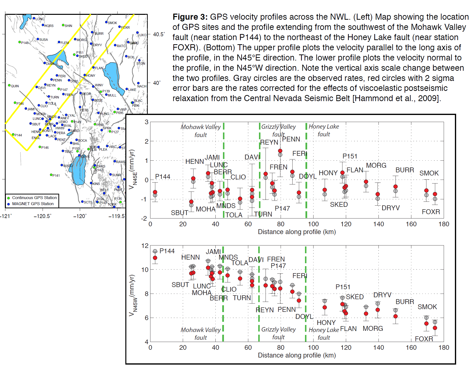
GPS velocity profiles across the NWL. (Left) Map showing the location of GPS sites and the profile extending from the southwest of the Mohawk Valley fault (near station P144) to the northeast of the Honey Lake fault (near station FOXR). (Bottom) The upper profile plots the velocity parallel to the long axis of the profile, in the N45°E direction. The lower profile plots the velocity normal to the profile, in the N45°W direction. Note the vertical axis scale change between the two profiles. Gray circles are the observed rates, red circles with 2 sigma error bars are the rates corrected for the effects of viscoelastic
postseismic relaxation from the Central Nevada Seismic Belt [Hammond et al., 2009].
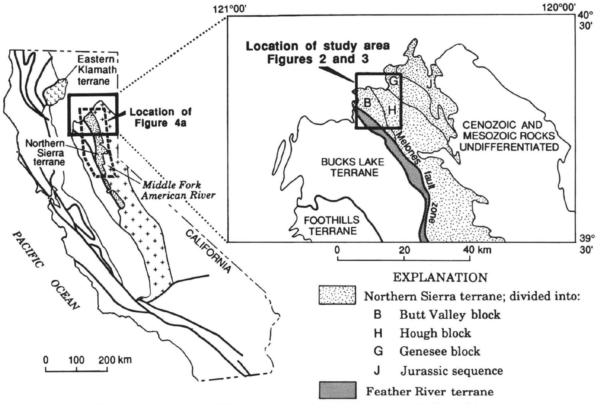
Map of northern California showing location of major tectonic units discussed in text, including Eastern Klamath and Northern Sierra terranes. Map also shows location of the Lake Almanor study area in the northern Sierra Nevada.
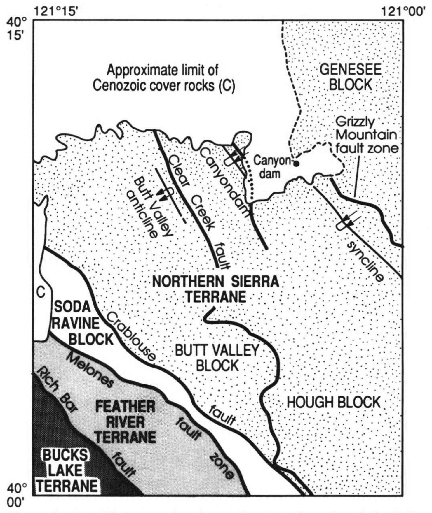
Simplified map showing major tectonic units of the Lake Almanor area.

A (above), Geologic map of the Lake Almanor Quadrangle, modified from Jayko (1988).
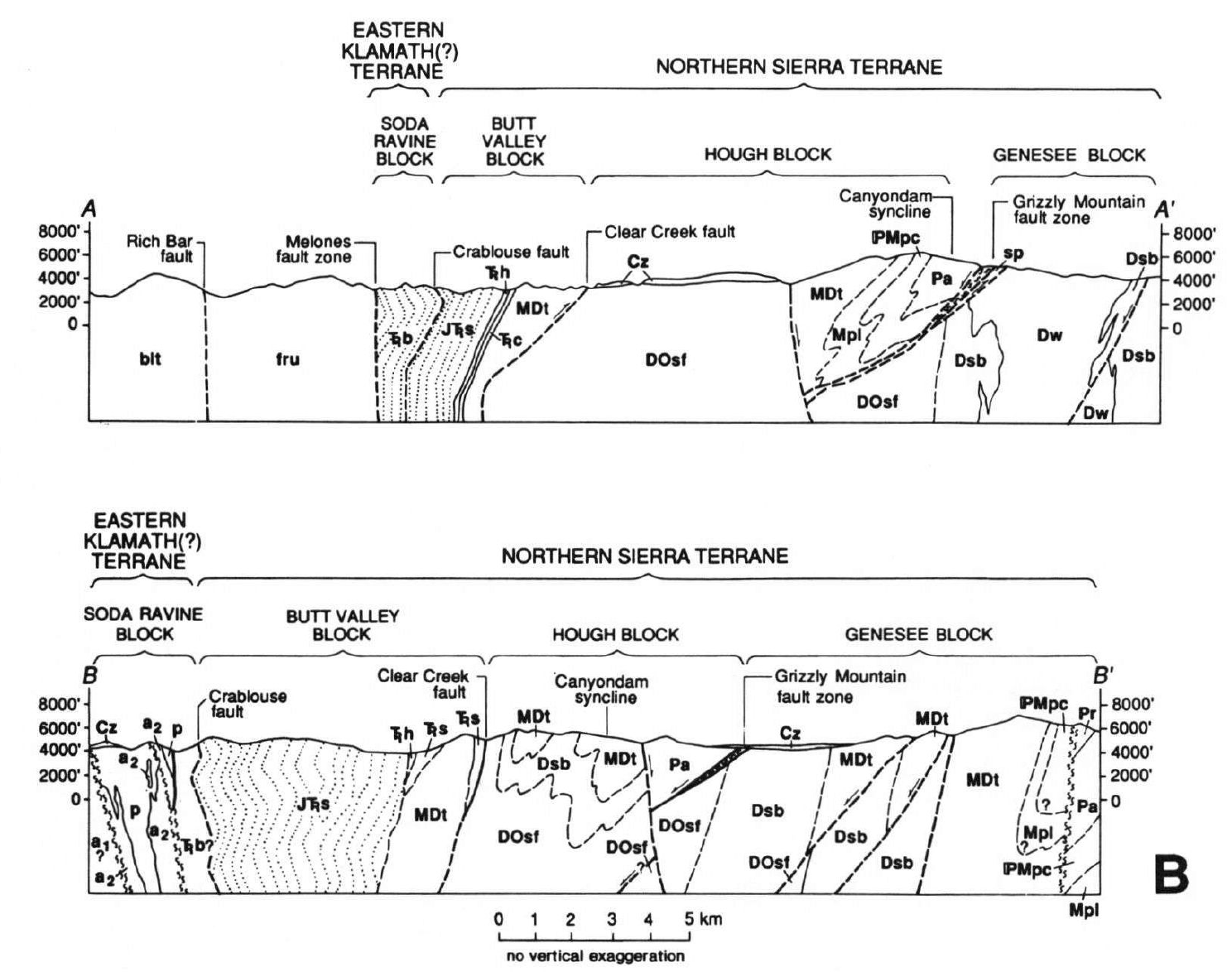
Structure sections of the Lake Almanor area, modified from Jayko (1988). Pattern in J T s unit of sections A-A’ and B-B’, and in T b unit of section A-A’ used to schematically show kink folds.
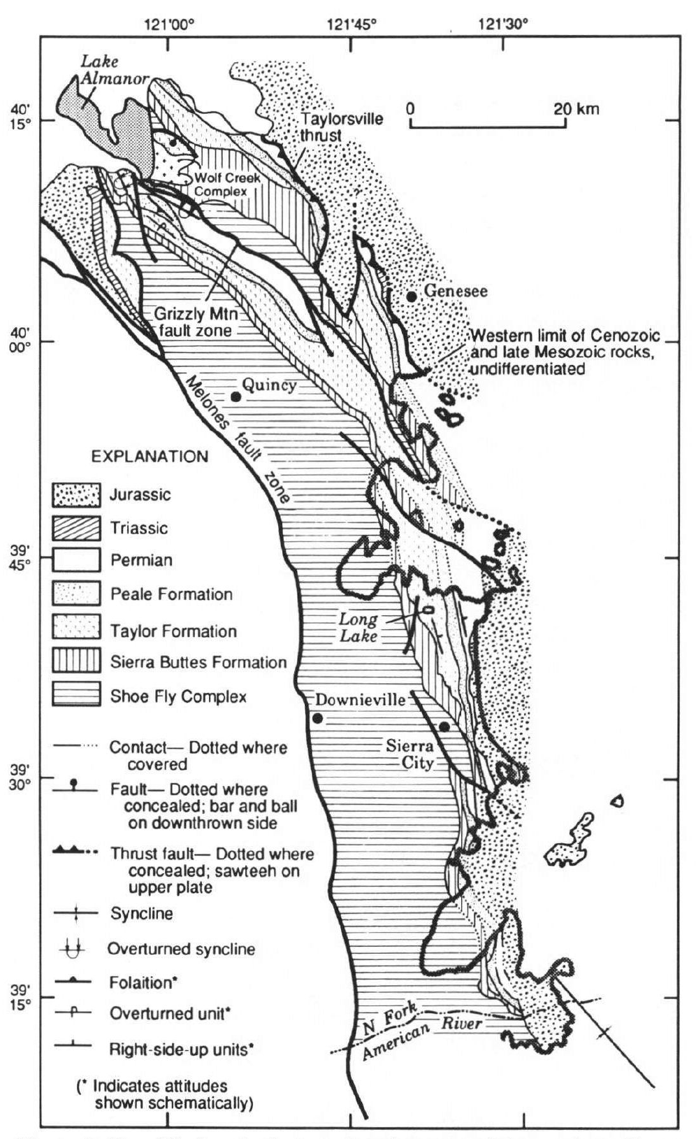
Simplified geologic map showing most of the northern Sierra terrane (modified from Harwood, 1988; D’Allura and others, 1977; Jayko, 1988).
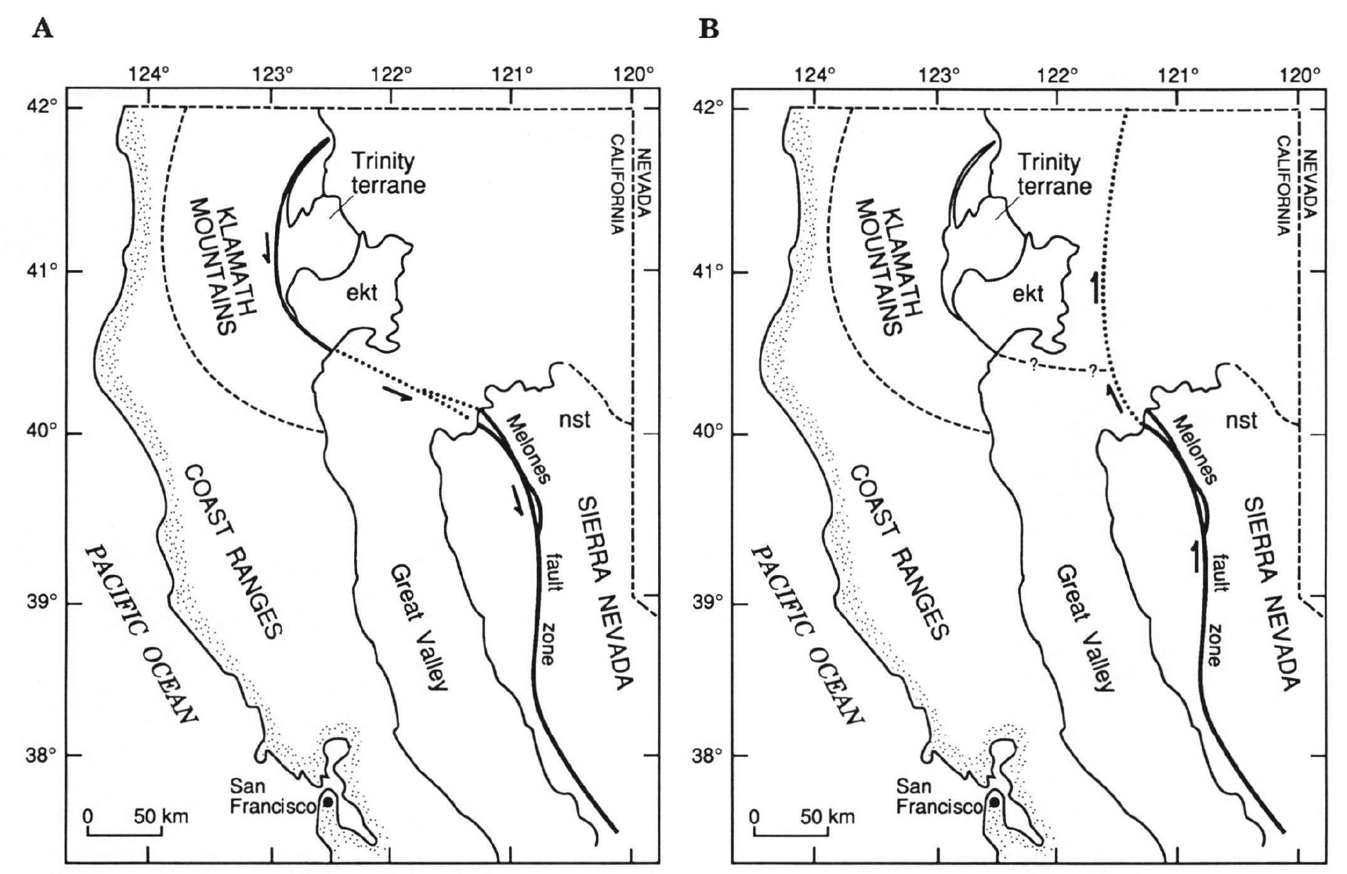
Schematic map. A, Northward continuation of the Melones fault zone to the west of the Eastern Klamath terrane (ekt), with inferred left-lateral displacement of tectonic slivers of Eastern Klamath terrane affinity. In this scenario the slivers and their bounding faults are considered to be part of the Melones fault zone. B, Northward continuation of the Melones fault zone east of the Klamath terrane, with inferred right-lateral displacement of the Eastern Klamath terrane relative to the northern Sierra terrane (nst). This scenario implies that the Eastern Klamath terrane was juxtaposed with the Northern Sierra terrane prior to northward displacement of the Eastern Klamath terrane.
- 1906.04.18 M 7.9 San Francisco
- 2023.05.11 M 5.5 Lake Almanor
- 2017.12.14 M 4.3 Laytonville
- 2016.11.06 M 4.1 Laytonville, CA
- 2016.11.03 M 3.8 Laytonville, CA
- 2016.08.10 M 5.1 Lake Pillsbury, CA
- 2016.08.04 M 4.5 Honey Lake, CA
- 2015.03.17 M 3.8 Lake Almanor
- 2015.08.30 M 3.6 Mendocino County, CA
- 2015.07.27 M 3.5 Point Arena, CA
- 2018.07.30 M 3.7 San Pablo Bay
- 2018.01.04 M 4.4 Berkeley
- 1989.10.18 M 6.9 Loma Prieta
- 2020.09.19 M 4.5 El Monte
- 2020.06.24 M 5.8 Lone Pine
- 2019.07.04 M 6.4 Ridgecrest
- 2019.07.05 M 6.4 / 7.1 Ridgecrest Update #1
- 2019.07.18 M 6.4 / 7.1 Ridgecrest Update #2
- 2019.07.20 M 6.4 / 7.1 Ridgecrest Update #3
- 2019.06.05 M 4.3 San Clemente Island
- 2018.04.05 M 5.3 Channel Islands
- 2018.04.05 M 5.3 Channel Islands Update #1
- 2016.02.23 M 4.9 Bakersfield
- 2015.12.30 M 4.4 San Bernardino, CA
- 2015.05.03 M 3.8 Los Angeles, CA
- 2015.04.13 M 3.3 Los Angeles, CA
- 2014.04.01 M 5.1 La Habra p-3
- 2014.03.29 M 5.1 La Habra p-2
- 2014.03.28 M 5.1 La Habra p-1
- 1994.11.17 M 6.7 Northridge, CA
- 1971.02.09 M 6.7 Sylmar, CA
San Andreas plate boundary Earthquake Reports
General Overview
Earthquake Reports
Northern CA
Central CA
Southern CA
- 2020.03.18 M 5.7 Salt Lake City, Utah
- 2020.03.31 M 6.5 Idaho
- 2017.09.02 M 5.3 Idaho
- 2020.05.15 M 6.5 Nevada
- 2016.12.28 M 5.7 swarm Nevada
- 2014.11.05 M 4.6 swarm Nevada
Basin and Range
General Overview
Earthquake Reports
Utah
Idaho
Nevada
Social Media
original thread:
#EarthquakeReport for M5.5 along Skinner flat fault in Lake Almanor northern CA
some brief info about the tectonics in previous reporthttps://t.co/77RgFixKanhttps://t.co/ysfzAxU5eG pic.twitter.com/O9I3WT5DgS
— Jason "Jay" R. Patton (@patton_cascadia) May 12, 2023
#EarthquakeReport for the M5.5 #LakeAlmanor #Earthquake #Sequence near #Chester #Canyondam #Greenville
i have compiled some of the tectonic research conducted in the area
see this and the interpretive posters herehttps://t.co/QTBAFWJyig pic.twitter.com/VqrcXAPirn
— Jason "Jay" R. Patton (@patton_cascadia) May 13, 2023
A M5.4 earthquake occurred near Lake Almanor (Plumas County) in northern California. Shaking reportedly felt 120 miles to the south in Sacramento. A quake of this size can potentially damage structures near the epicenter. CGS is monitoring this area. #earthquake pic.twitter.com/HZ9LyJi1DI
— California Geological Survey (@CAGeoSurvey) May 11, 2023
Updated map for the M5.5 earthquake in Plumas County, near Lake Almanor. Several M2+ aftershocks have been measured. Continued aftershocks can be expected. This quake was on a normal fault in the northern Sierra Nevada.
Did you feel it? Let us know! pic.twitter.com/dI1HE14IFn
— California Geological Survey (@CAGeoSurvey) May 12, 2023
The Sacramento Bee interviewed CGS geologist, Tim Dawson, about the Almanor Fault Zone and the recent M5.5 and M5.2 earthquakes in Plumas County this week. #earthquake @sacbee_news @CalConservation https://t.co/Z5F2Yuoowu
— California Geological Survey (@CAGeoSurvey) May 12, 2023
Information on the M5.5 earthquake in Northern California https://t.co/LbO0pPJiCp pic.twitter.com/EJaOyIrZpa
— Wendy Bohon, PhD 🌏 (@DrWendyRocks) May 12, 2023
Focal mechanism looks similar to the May 23, 2013, Mw 5.7 Canyondam earthquake and the main shock looks located at the northern tip of that previous EQ sequence. #lakealmanor #earthquake pic.twitter.com/XeLJmsxzXD
— Danielle Madugo (@DanielleVerdugo) May 12, 2023
Good afternoon Northeastern, CA! Did you feel the M5.4 quake about 3 miles from East Shore at 4:19 pm? The #ShakeAlert system was activated. See: https://t.co/ggzHGYCcWf @Cal_OES @CAGeoSurvey pic.twitter.com/ThQQFtg4os
— USGS ShakeAlert (@USGS_ShakeAlert) May 11, 2023
A M5.5 earthquake recently occurred in Plumas County, CA near Lake Almanor. Moderate earthquakes occasionally occur on faults in the region, including a M5.7 earthquake at Lake Almanor in 2013. pic.twitter.com/UgkCfOE582
— EarthScope Consortium (@EarthScope_sci) May 12, 2023
Feel today's M5.5 quake? Did you get a warning? People with the @MyShakeApp got up to 15 sec warning. Want a warning for the next earthquake? Download the free app! @BerkeleySeismo @Cal_OES #earthquake pic.twitter.com/TQlPKALTyC
— Richard Allen (@RAllenBerkeley) May 12, 2023
The Butt Creek Fault Zone is near today’s Almanor Fault Zone. There’s totally a crack in Butt Creek. Huh huh huh. pic.twitter.com/CA7P2OqKPo
— Ryan Hollister (@phaneritic) May 12, 2023
Earthquakes in northeastern California? Yesterday's 5.2 falls within a zone of high hazard that includes the eastern Sierra corridor, basically the East Wing of the plate boundary between the Pacific & North American plates. pic.twitter.com/X7pOv4dQLr
— Dr. Susan Hough 🦖 (@SeismoSue) May 12, 2023
Aftershock of yesterday's M5.5 in California! To learn about the mainshock, visit my blog. (Link is in my bio; Twitter is limiting tweets that mention the platform.)
Both quakes triggered the USGS ShakeAlert early warning system. https://t.co/L2zTVXYfEn pic.twitter.com/degEy6kYIq
— Dr. Judith Hubbard (@JudithGeology) May 12, 2023
This map shows GPS velocities in the Western US relative to the stable interior of North America, with the location of recent earthquakes at Lake Almanor in CA marked by a star. The North American Plate in CA moves to the northwest due to deformation along the plate boundary. pic.twitter.com/5VJlHs9R0u
— EarthScope Consortium (@EarthScope_sci) May 12, 2023
- Frisch, W., Meschede, M., Blakey, R., 2011. Plate Tectonics, Springer-Verlag, London, 213 pp.
- Hayes, G., 2018, Slab2 – A Comprehensive Subduction Zone Geometry Model: U.S. Geological Survey data release, https://doi.org/10.5066/F7PV6JNV.
- Holt, W. E., C. Kreemer, A. J. Haines, L. Estey, C. Meertens, G. Blewitt, and D. Lavallee (2005), Project helps constrain continental dynamics and seismic hazards, Eos Trans. AGU, 86(41), 383–387, , https://doi.org/10.1029/2005EO410002. /li>
- Jessee, M.A.N., Hamburger, M. W., Allstadt, K., Wald, D. J., Robeson, S. M., Tanyas, H., et al. (2018). A global empirical model for near-real-time assessment of seismically induced landslides. Journal of Geophysical Research: Earth Surface, 123, 1835–1859. https://doi.org/10.1029/2017JF004494
- Kreemer, C., J. Haines, W. Holt, G. Blewitt, and D. Lavallee (2000), On the determination of a global strain rate model, Geophys. J. Int., 52(10), 765–770.
- Kreemer, C., W. E. Holt, and A. J. Haines (2003), An integrated global model of present-day plate motions and plate boundary deformation, Geophys. J. Int., 154(1), 8–34, , https://doi.org/10.1046/j.1365-246X.2003.01917.x.
- Kreemer, C., G. Blewitt, E.C. Klein, 2014. A geodetic plate motion and Global Strain Rate Model in Geochemistry, Geophysics, Geosystems, v. 15, p. 3849-3889, https://doi.org/10.1002/2014GC005407.
- Meyer, B., Saltus, R., Chulliat, a., 2017. EMAG2: Earth Magnetic Anomaly Grid (2-arc-minute resolution) Version 3. National Centers for Environmental Information, NOAA. Model. https://doi.org/10.7289/V5H70CVX
- Müller, R.D., Sdrolias, M., Gaina, C. and Roest, W.R., 2008, Age spreading rates and spreading asymmetry of the world’s ocean crust in Geochemistry, Geophysics, Geosystems, 9, Q04006, https://doi.org/10.1029/2007GC001743
- Pagani,M. , J. Garcia-Pelaez, R. Gee, K. Johnson, V. Poggi, R. Styron, G. Weatherill, M. Simionato, D. Viganò, L. Danciu, D. Monelli (2018). Global Earthquake Model (GEM) Seismic Hazard Map (version 2018.1 – December 2018), DOI: 10.13117/GEM-GLOBAL-SEISMIC-HAZARD-MAP-2018.1
- Silva, V ., D Amo-Oduro, A Calderon, J Dabbeek, V Despotaki, L Martins, A Rao, M Simionato, D Viganò, C Yepes, A Acevedo, N Horspool, H Crowley, K Jaiswal, M Journeay, M Pittore, 2018. Global Earthquake Model (GEM) Seismic Risk Map (version 2018.1). https://doi.org/10.13117/GEM-GLOBAL-SEISMIC-RISK-MAP-2018.1
- Zhu, J., Baise, L. G., Thompson, E. M., 2017, An Updated Geospatial Liquefaction Model for Global Application, Bulletin of the Seismological Society of America, 107, p 1365-1385, https://doi.org/0.1785/0120160198
- Bormann, J.M., 2013, New Insights into Strain Accumulation and Release in the Central and Northern Walker Lane, Pacific-North American Plate Boundary, California and Nevada, USA [Ph.D. dissertation]: Reno, University of Nevada, Reno, 134 p.
- Bormann, J.M., Hammond, W.C., Kreemer, C., and Blewitt, G., 2015. GPS constraints on the present-day slip rates of the Honey Lake and Mohawk Valley Faults, Northern Walker Lane in Redwine et al., 2015. The 2015 Annual Pacific Cell Friends of the Pleistocene field trip. From Mohawk Valley to Caribou Junction Middle and North Forks of the Feather River, northeastern California. Friday through Sunday, September 25-27, 242 pp.
- Chapman, K., Gold, M.B., Boatwright, J., Sipe, J., Quitoriano, V., Dreger, D., and Hardebeck, J., 2016, Faulting, damage, and intensity in the Canyondam earthquake of May 23, 2013: U.S. Geological Survey Open-File Report 2016-1145, 49 p., http://dx.doi.org/10.3133/ofr20161145.
- Gold, R., Briggs, R.W., Personius, S.F., Crone, A.J., Mahan, S.A., and Angster, S.J., 2014. Latest Quaternary paleoseismology and evidence of distributed dextral shear along the MohawkValley fault zone, northern Walker Lane, California in Journal of Geophysical Research, v. 119, 5014-5032, doi:10.1002/2014JB010987
- Jayko, A. S., 1990, Stratigraphy and tectonics of Paleozoic arc-related rocks of the northernmost Sierra Nevada, California; The eastern Klamath and northern Sierra terranes, in Harwood, D. S., and Miller, M. M., eds., Paleozoic and early Mesozoic paleogeographic relations; Sierra Nevada, Klamath Mountains, and related terranes; Boulder, Colorado, Geological Society of America Special Paper 255, https://doi.org/10.1130/SPE255-p307
References:
Basic & General References
Specific References
Return to the Earthquake Reports page.
- Sorted by Magnitude
- Sorted by Year
- Sorted by Day of the Year
- Sorted By Region